Into the Bend is a 1,200 sq. ft. office in Chembur that we designed and executed in five months, on a tight budget. The client wanted it to feel warm and creative, not corporate. Here’s how we approached it, and what we’d tell anyone planning an office fit-out against the clock.
1. decide fast, once
Speed on site comes from decisions made early. We fixed the layout, materials and lighting in the first weeks and drew everything before work began: workstations, cabins, storage, the feature wall and the lighting grid. Changing your mind on site is the most expensive thing in any project. On a short programme it’s fatal.
2. plan the floor around how the team works
- Open workstations in the centre. It’s the most efficient use of space, and good for collaboration.
- Private cabins on the edge, in arched black metal frames and glass, so light still reaches the whole floor.
- A meeting room that can open up to the floor for bigger gatherings.
- Storage on the walls, full height, so the floor stays clear.
3. spend where people look
This is the single most useful budget rule we know. Most of the office uses cost-effective vitrified tiles and oak laminate joinery. Both are durable, warm-looking and quick to install. We concentrated the expensive material, red marble, in the three places visitors notice: the reception counter (with fluted detailing), the conference room and the powder room.
Visitors remember those three moments. Nobody notices that the desks are laminate.
4. one bold gesture beats many small ones
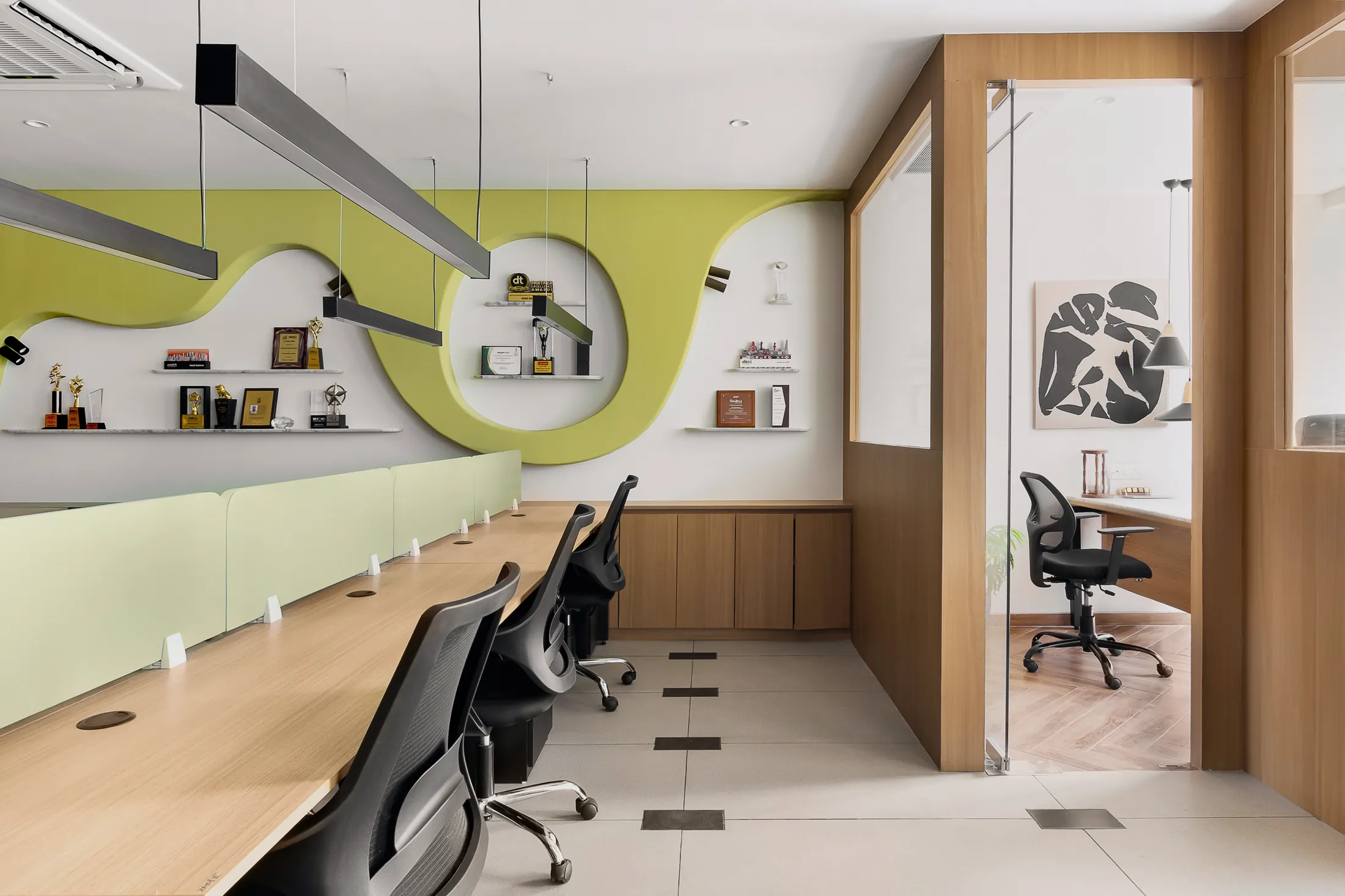
Instead of scattering decorative features, we put the identity into one element: a sculpted lime-green feature wall that ripples along the work area, with circular niches holding the company’s awards and books. It’s built from layered gypsum board shaped on site, which is far cheaper than fabricated curved panels. It’s also the brightest colour in the office, placed where everyone sees it.
5. change flooring to define zones
Rather than build more walls, we changed the floor: neutral tiles where people work, herringbone wood finish in the reception and cabins. The zones read clearly, at a fraction of the cost and time of partitions.
6. sort out acoustics and lighting at the drawing stage
Glass cabins look open, but they must still give privacy for calls. We specified the partitions and seals with acoustics in mind. We also aligned the linear pendant lights with the workstation grid and the architecture, so the ceiling reads as calm and ordered. That kind of decision is free on paper and expensive to fix later.
7. let the brand live in the architecture
The client’s achievements are displayed in the feature wall’s niches and on the shelves, not on printed panels. The result says “confident and growing” without a single slogan.
a quick checklist for your office project
- Lock the layout and materials before work starts.
- Decide the three places where you’ll spend more.
- Pick one bold element for identity.
- Use flooring and lighting to define zones before adding walls.
- Plan acoustics for every glass room.
- Keep storage on the walls and off the floor.
See the Into the Bend case study and our office interiors service, or get in touch about your workplace.