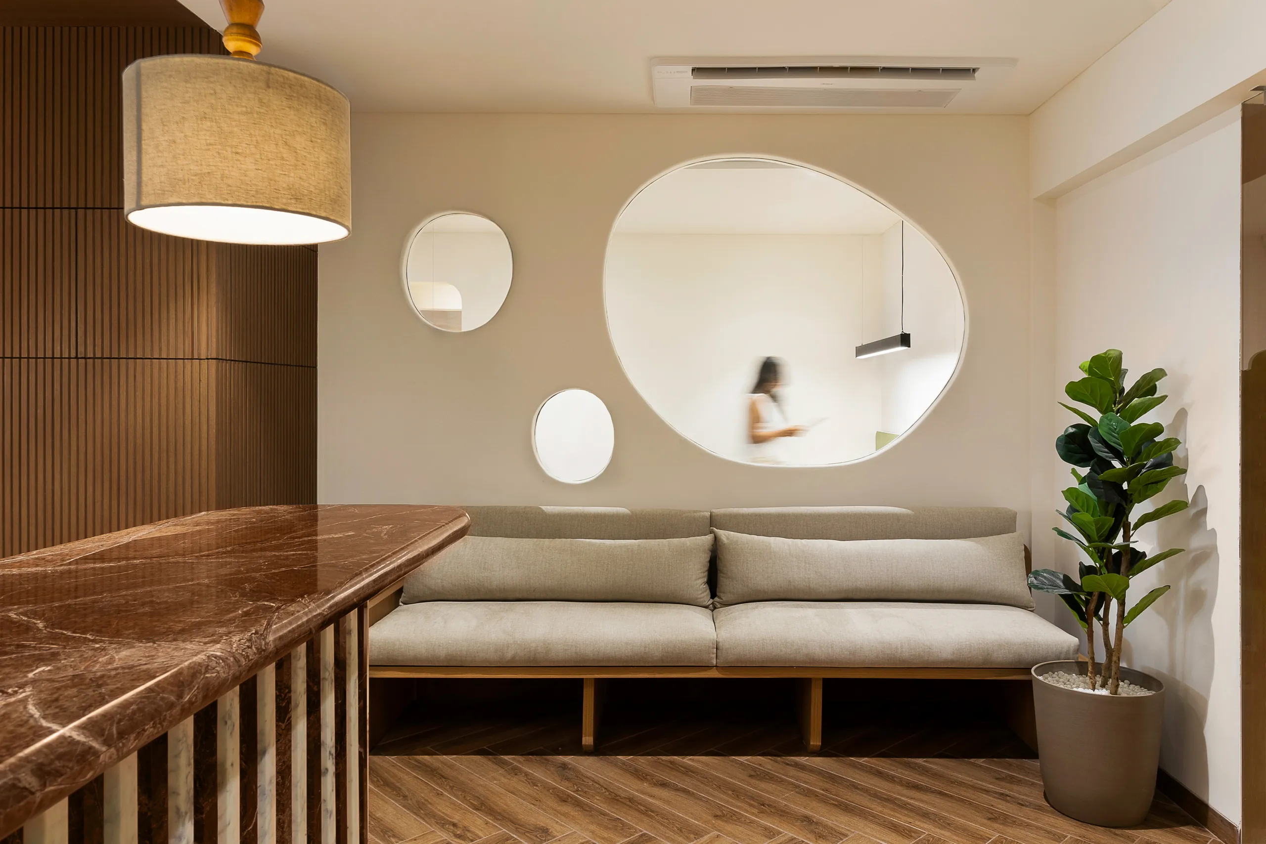
Into the Bend is a 1,200 sq. ft. office in Chembur, designed and executed in five months on a tight budget. The client wanted a contemporary workplace that felt creative, professional and confident about its growth. Above all, they wanted it to feel warm and welcoming, not corporate and sterile.
the brief
The office had to fit a lot into a compact floor plate:
- an open workstation area
- private cabins
- a meeting room that could open up when needed
- a reception and lounge that makes a good first impression
- a way to show the company’s achievements without the place looking like a showroom
the idea: structure and softness
We called the design language organic modern. The plan is rational and efficient: linear workstations, a clear grid and straight circulation. Against that order, we introduced curves, niches and texture, so the space never feels rigid.
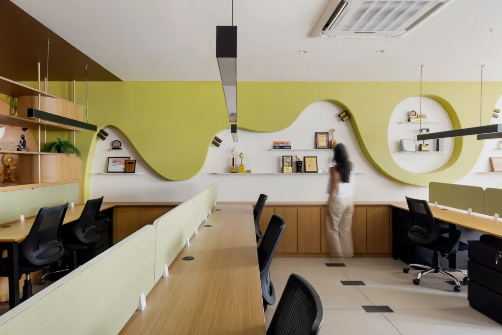
The key gesture is a sculpted lime-green feature wall that ripples along the main work area. Its circular niches hold awards, books and objects. Branding becomes architecture, and the brightest colour in the office sits exactly where everyone sees it.
planning a compact floor plate
- Open workstations occupy the centre, with linear desks and integrated green partitions. That gives individual focus without isolating people.
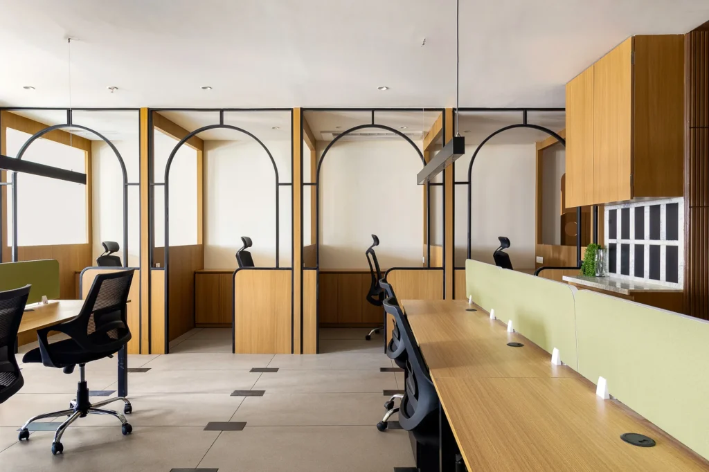
- Private cabins sit along the edge, enclosed in arched black metal frames and glass. You get separation and acoustic privacy while light and sightlines run through the whole office.
- The meeting room is placed so it can be opened up to the rest of the floor when needed.
- Storage is wall-mounted in full-height cabinetry, which keeps the floor clear and circulation intuitive.
- Flooring changes with use: neutral tiles in work zones, herringbone wood finish in the reception and cabins. The zones read as distinct without any extra walls.
spending the budget where it shows
The budget meant every material choice had to earn its place:
| Where | What we used | Why |
|---|---|---|
| Work zones | Cost-effective vitrified tiles | Durable, low maintenance, affordable across most of the floor |
| Workstations and storage | Custom carpentry in oak laminate | Warmth and continuity at a fraction of solid timber’s cost |
| Feature wall | Layered gypsum board, sculpted on site | Achieves the curves without expensive fabrication |
| Partitions | Black metal frames and glass | A contemporary edge, plus light through the plan |
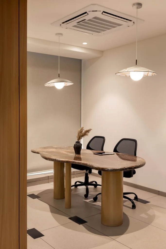
| Reception counter, conference, powder room | Red marble, including fluted detailing on the counter | Concentrated in the three places visitors notice most |
That last row is the principle: put the expensive material where people look, and keep everything else honest and hard-wearing. We expand on this in how we designed an office in five months on a budget.
what was hard
Getting the curved green wall smooth, with niches integrated cleanly, took careful detailing and constant coordination on site. Balancing openness with privacy was the other challenge. The glass cabins could not be allowed to compromise acoustic comfort. And the lighting layout had to line up with both the workstation grid and the architectural features to keep everything visually calm.
the result
Into the Bend shows that an office can be disciplined and expressive at once. The layout is efficient enough for daily operations, and the curves, warm wood and a single confident colour give it an identity of its own. It feels less like a corporate floor and more like a place people want to come back to.
Related: office interiors in Mumbai · our process · how much does interior design cost in Mumbai?
Photographs by Saurabh Madan.