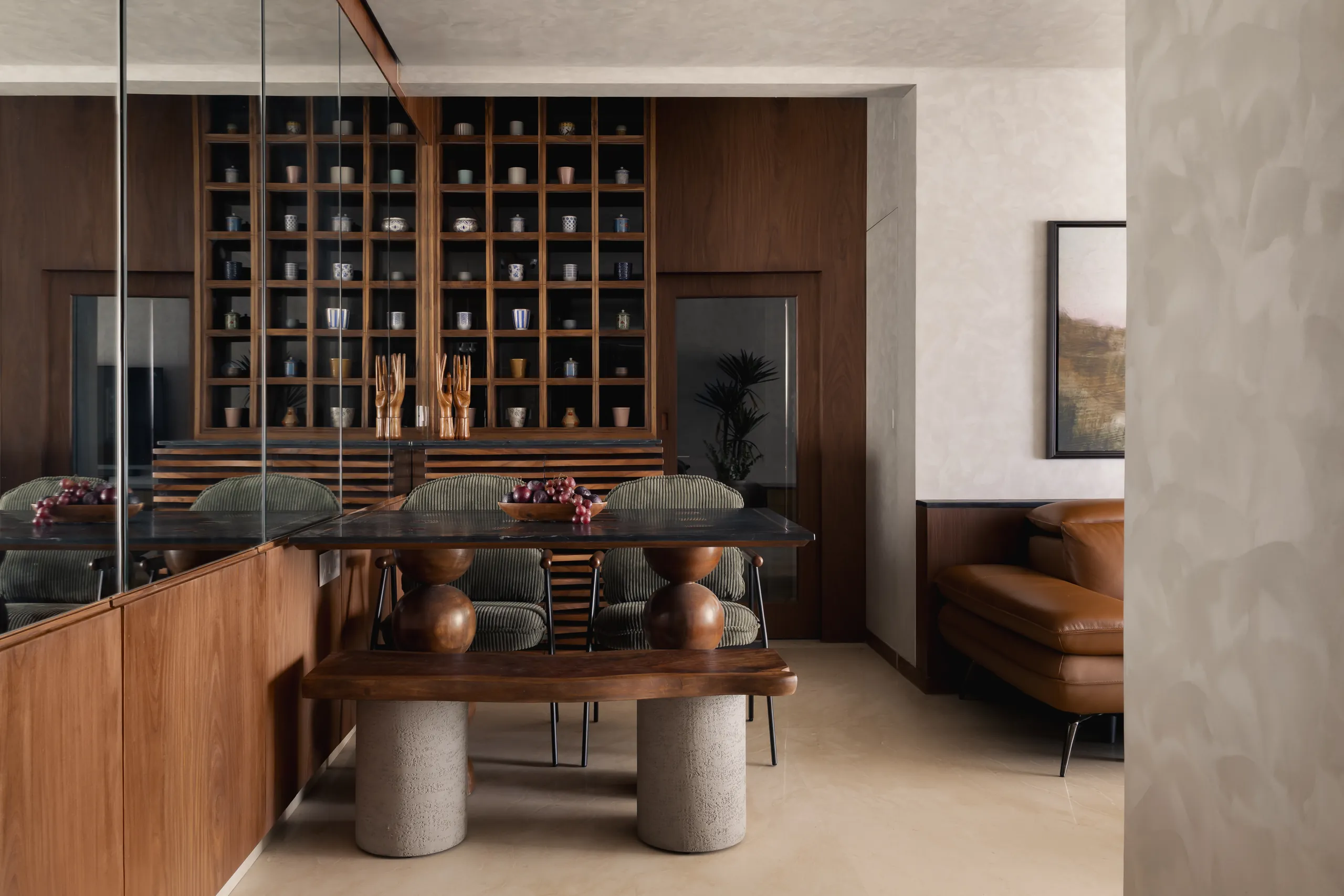
Plum House is the project where one of us was also the client. It’s Anushri’s own home, shared with her husband. The one-bedroom apartment in Breach Candy was bought as a bachelor’s pad three years before their wedding. The building is about 50 years old. By the time we started, the flat no longer matched the life happening inside it. It needed to become a home for two, and one that could hold family and friends without feeling crowded.
The renovated portion is 386 sq. ft., within a 650 sq. ft. home. Everything we usually ask a client, Anushri had to ask herself, and answer honestly.
the brief: comfort over perfection
On every project, we start with how people actually live, not with finishes. Do they host? Do they travel? Is the evening spent on the couch or at the dining table? The brief for Plum House came straight out of the couple’s answers:
- Mornings start with coffee, so the kitchen needed a proper coffee station, not a corner of the counter.
- Drawings get reviewed at night, so the dining table had to work as a desk.
- They host often, so a very small flat had to seat a dozen people without anyone feeling squeezed.
- They collect things on their travels (cups, pottery, objects from markets), and wanted them part of the house, not stored away.
“We didn’t design this house to impress people,” Anushri says. “We designed it to give ourselves a safe space to be ourselves.”
designing a small flat that stretches
At first glance, Plum House feels intimate. Its real achievement is how far it stretches. Despite its size, it has hosted twelve guests at a time. That came from planning, not luck:
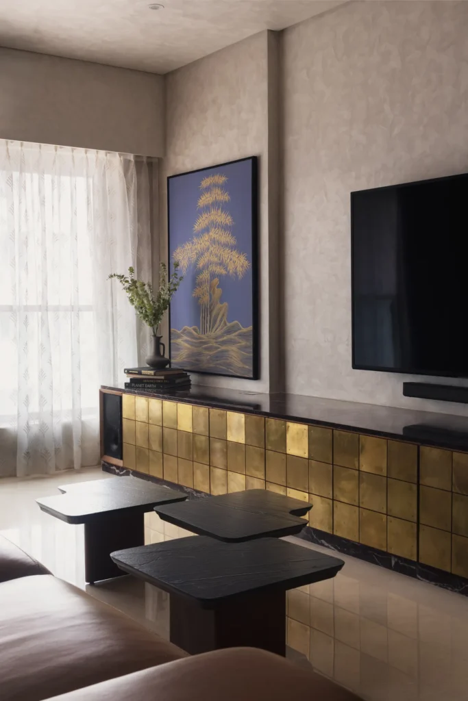
- The long brass-clad TV console doubles as extra seating.
- The sculptural coffee tables (Brazilian Black marble tops on teak bases) split apart and nest back together. They work as serving surfaces, side tables or footrests.
- Circulation is kept clear between living, dining and kitchen. People move naturally from one zone to the next instead of getting stuck in a corridor.
- Storage is built in everywhere. A mirrored wall hides full-height cabinets and bounces daylight back into the room, so the flat feels wider than it is.
If you’re working with a compact apartment yourself, we’ve written up the lessons in more detail in what a 386 sq. ft. home taught us about small apartments.
a wall of memories instead of a kitchen wall
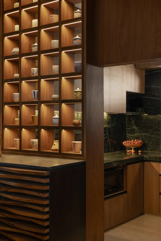
The defining move in the flat sits between the kitchen and living room. Rather than close the kitchen off, we built a timber display wall of open cubbies, inspired by teahouses and ceramics shops in Kyoto.
The size of each cubby was set by an unlikely object: cups. The mugs the couple have collected on their travels, and the pottery they’ve made together, have consistent proportions. They gave the shelving its rhythm. The wall now separates the two spaces without blocking light or sightlines, and it’s become a record of years of trips. It sits on top of an existing bar unit, so a familiar piece of furniture became the emotional centre of the home.
materials chosen to age, not to impress
The material palette deliberately avoids trends:
| Material | Where | Why |
|---|---|---|
| Off-white textured plaster | Walls | A quiet, tactile backdrop that catches daylight |
| Teak veneer | Display wall, joinery | Warm and durable, and it deepens with age |
| Levanto Red marble | TV console base, details | Rich colour without paint |
| Green Garnet stone | Kitchen | A dark, grounded surface for daily cooking |
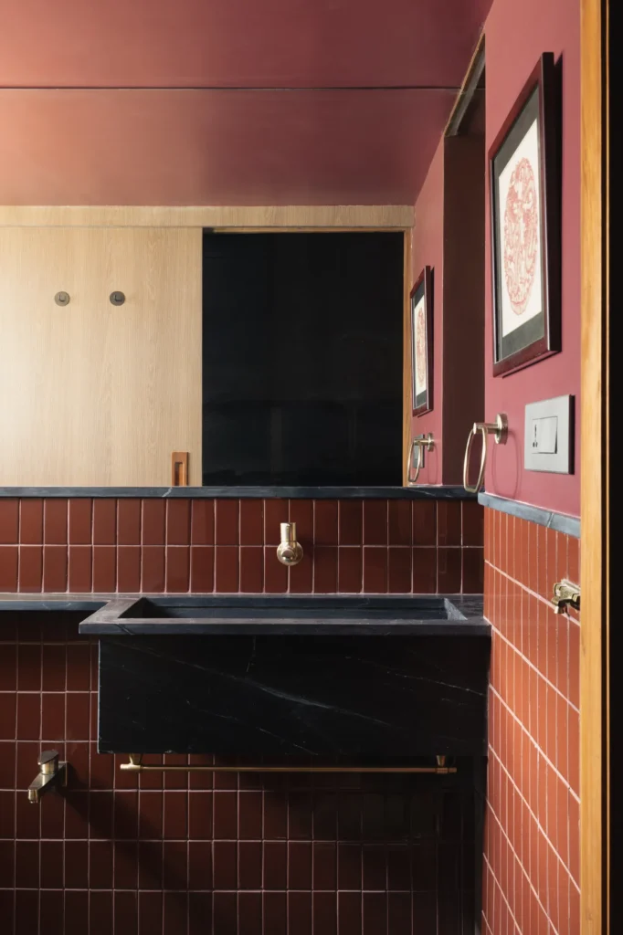
| Brazilian Black marble | Coffee tables, bathroom basin | Contrast and weight |
| Raw brass | TV console, fixtures | Develops a soft patina instead of staying “new” |
“The Levanto Red marble was often rejected,” Anushri says, “but I always knew it was right for us.” It’s a stone we now recommend to clients more confidently, having seen how it lives day to day.
The brass console took the longest to decide. We tried metallic tiles, copper sheets and specialised finishes. In the end we taped a square of raw brass to the console and waited. Over two weeks, the mirror-bright surface mellowed into a soft patina. “The brass wasn’t ageing,” Maitri says. “It was settling in.”
That idea, that natural materials get better because they’re allowed to change, runs through all our work. We wrote more about it in lime plaster, and why we keep coming back to it.
light: two versions of the same home
By day, natural light moves across the textured plaster and the mirrored wall pushes it deeper into the flat. By night, overhead lights give way to dimmable decorative fixtures that pick out brass, stone and timber.
“At night we’re usually on the recliner, talking about our day,” Anushri says. “The lights are dimmed, and all you really notice is the brass catching the light. The whole house feels different.”
The recliner, by the way, is ten feet long. It took a search across countless stores in Mumbai before we found the right one in Bengaluru.
renovating inside a 50-year-old building
Plum House is also a lesson in working with older Mumbai stock. Buildings of this age bring hidden plumbing and electrical surprises, uneven walls and floors, and society rules on working hours and debris. If you’re planning something similar, read our checklist for renovating an old Mumbai apartment before you commit to a budget.
what designing a home for one of us changed
Seeing every specification lived with up close has changed how we practise. We’re more committed to honest materials that improve with age. We’re more willing to push a client towards an unusual stone or a raw finish. And we’re more convinced that the most important input on any project is the people who’ll come home to it.
“If someone copied this home exactly,” Anushri says, “they’d still be missing the most important thing: individuality.”
Related: apartment renovation in Mumbai · home interiors · how much does interior design cost in Mumbai?
Plum House was featured by Volume Zero. Photographs by Saurabh Madan.